Get In Touch
info@onzelabs.com
Branding Packaging March 23, 2024

RAMPART

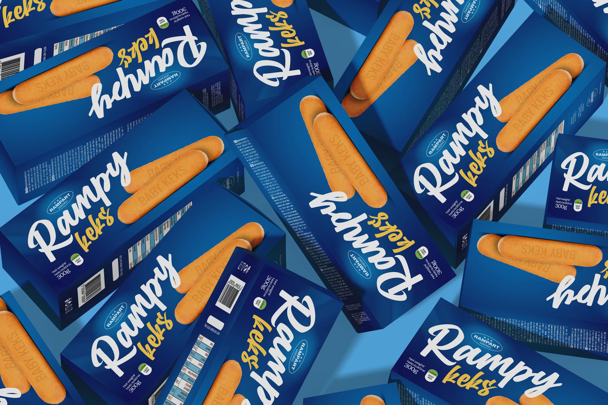
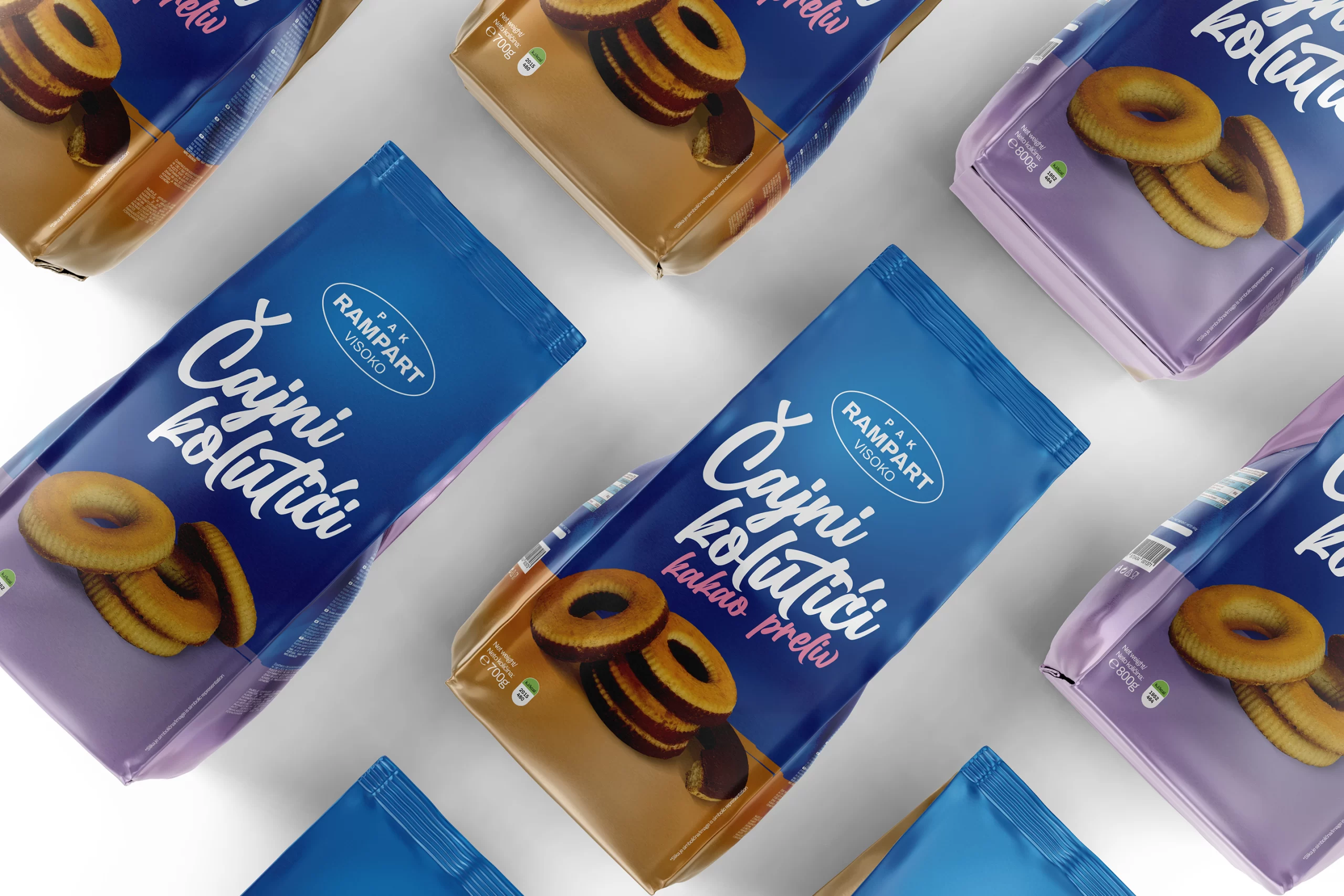
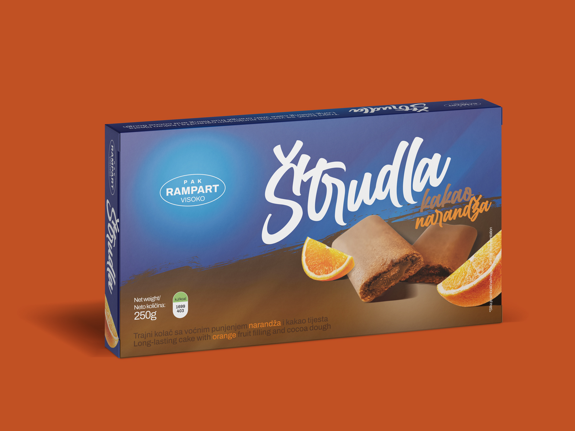
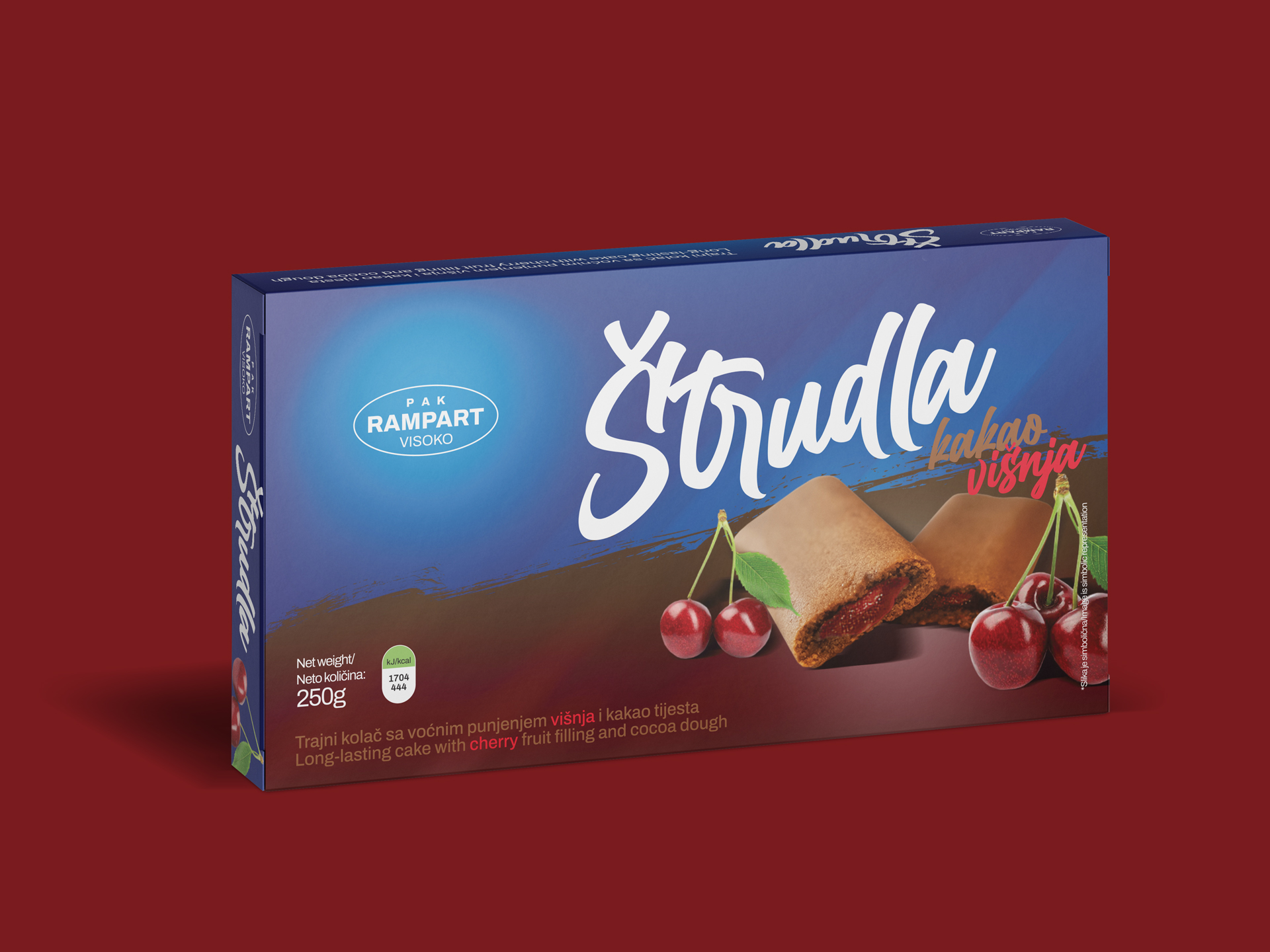
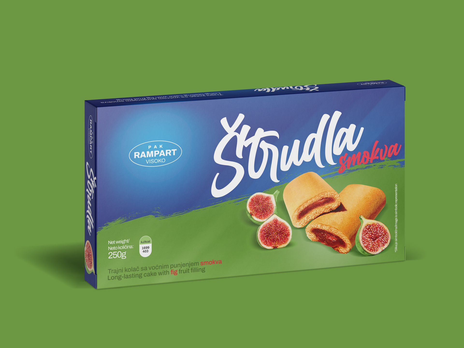
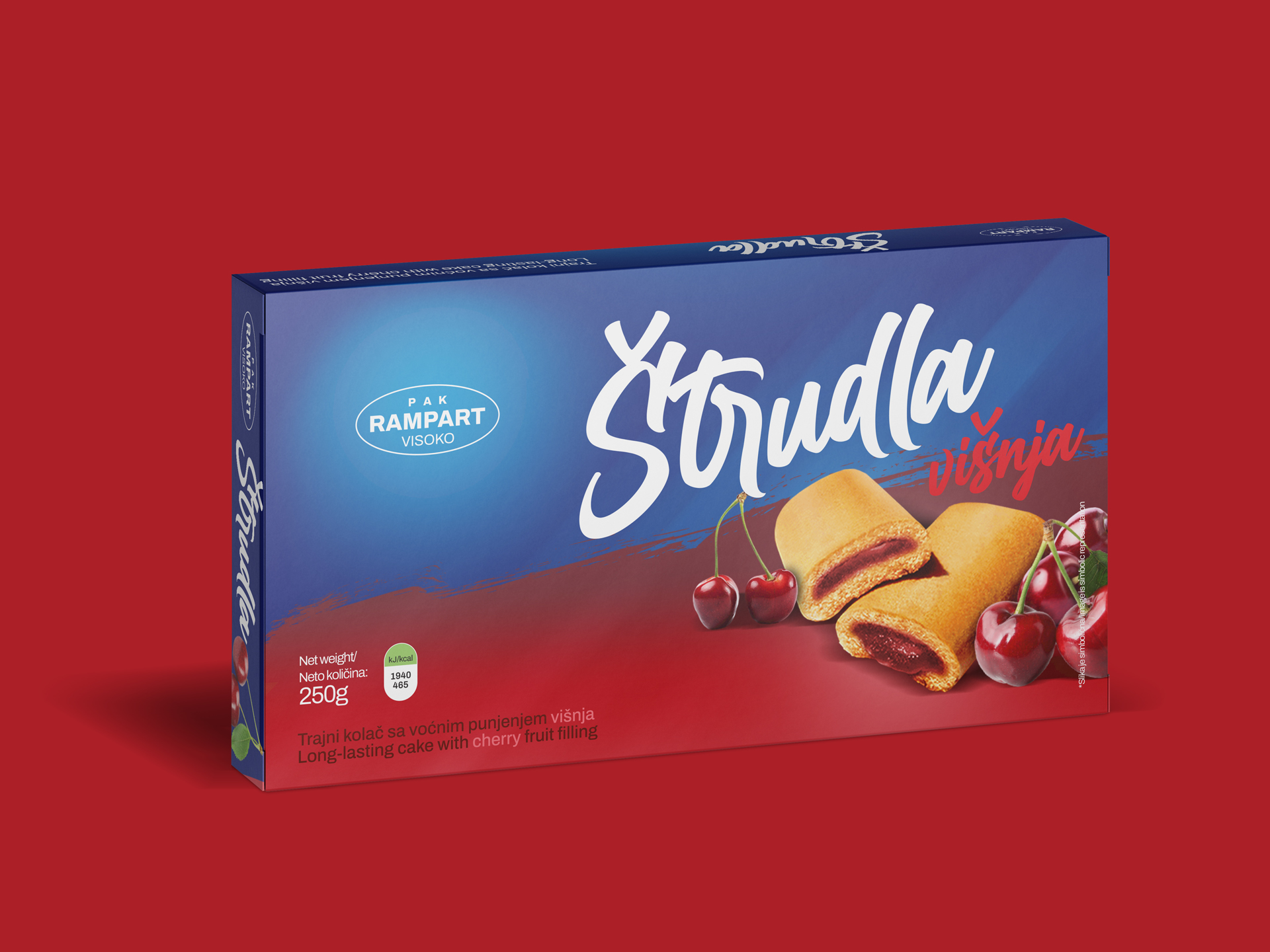
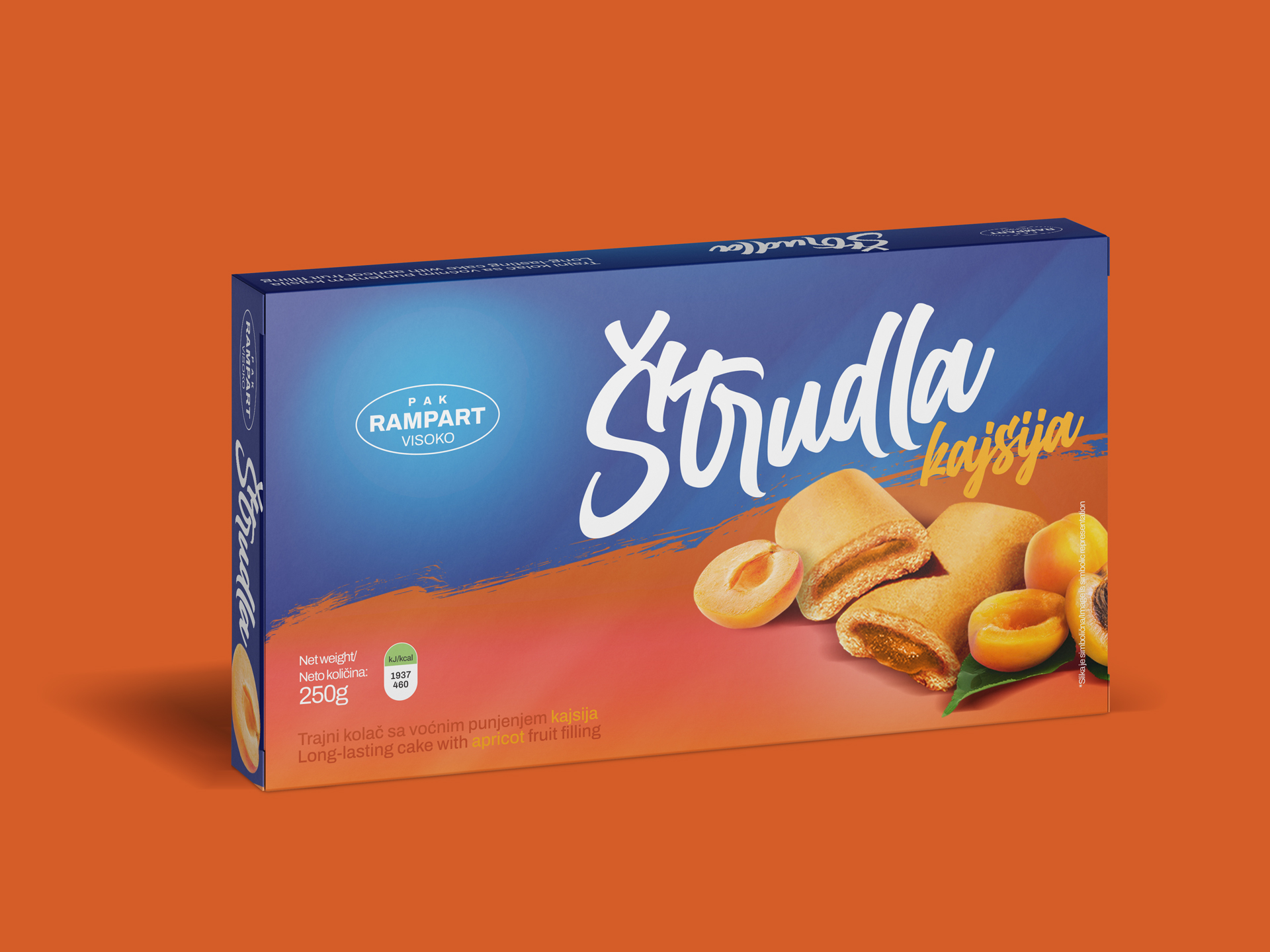
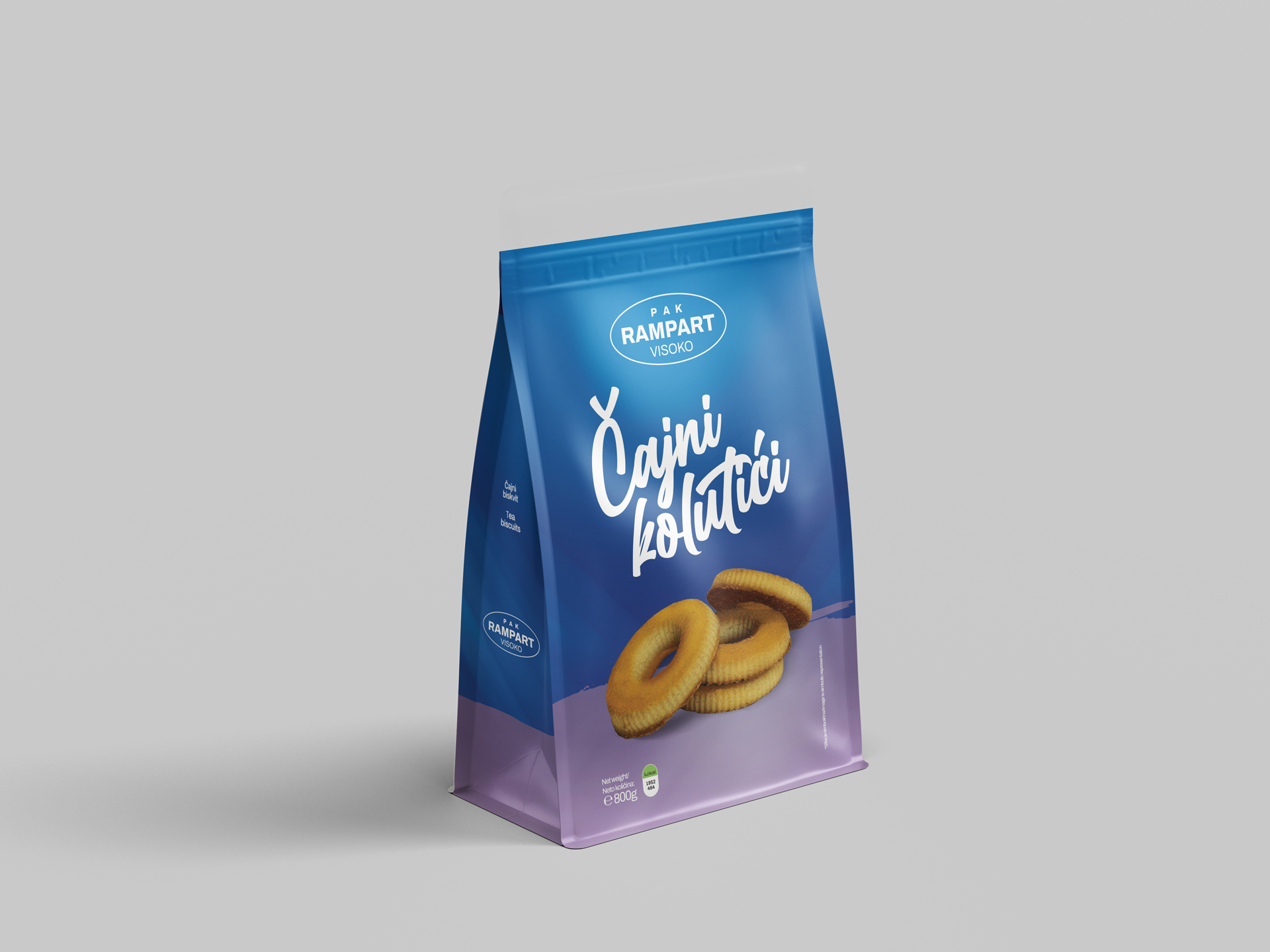
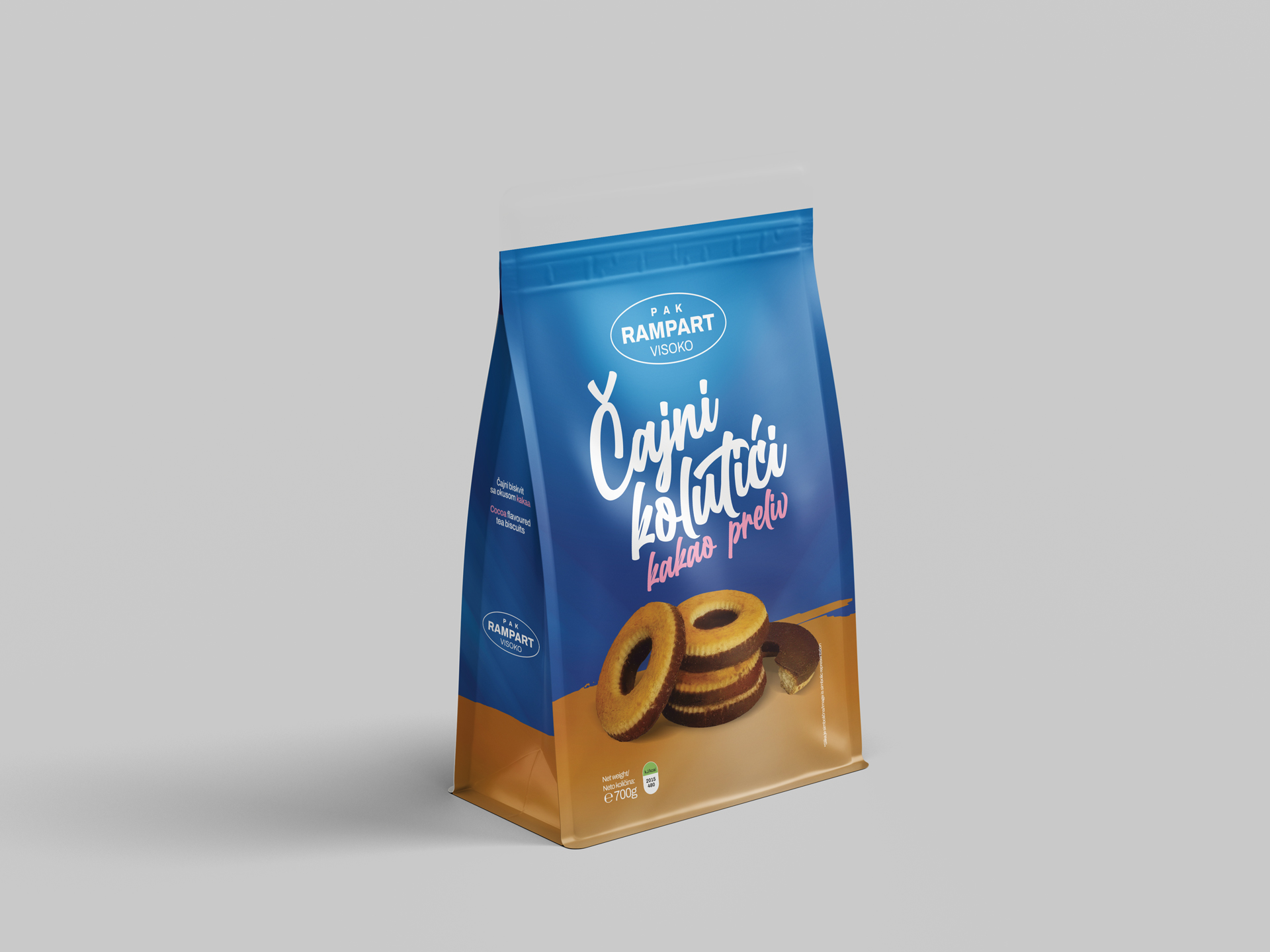
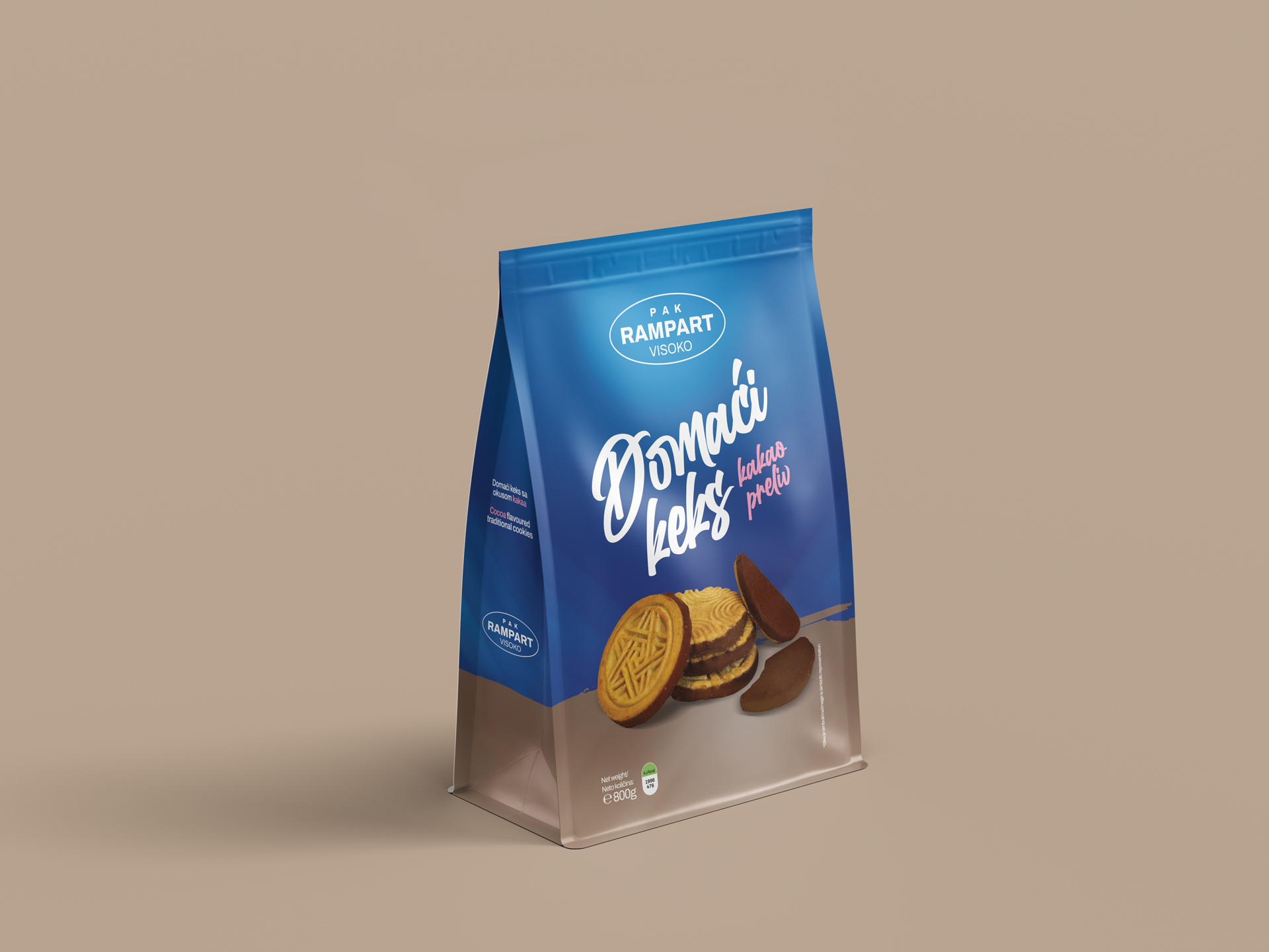
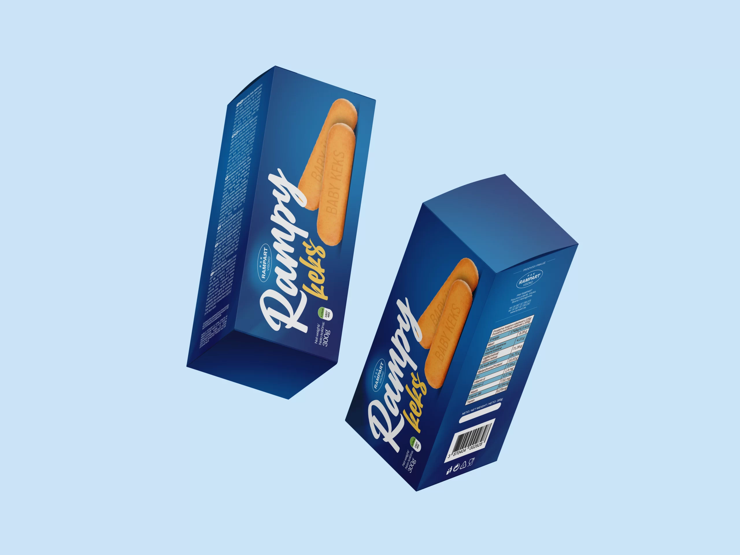
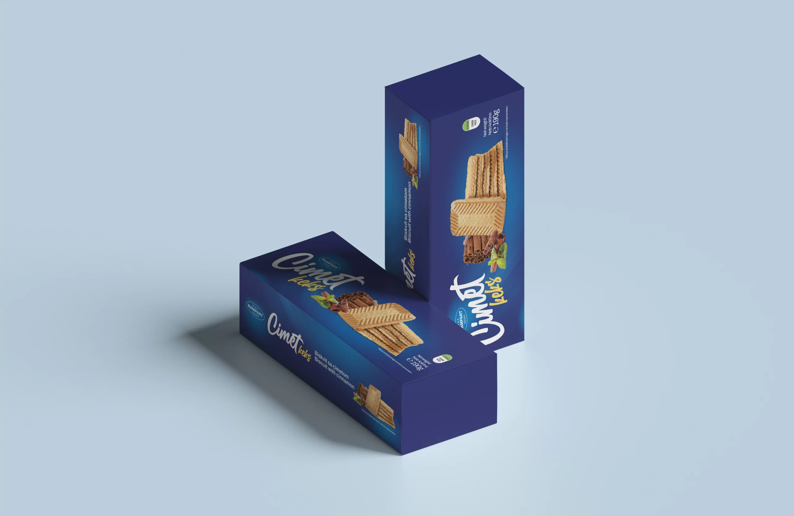
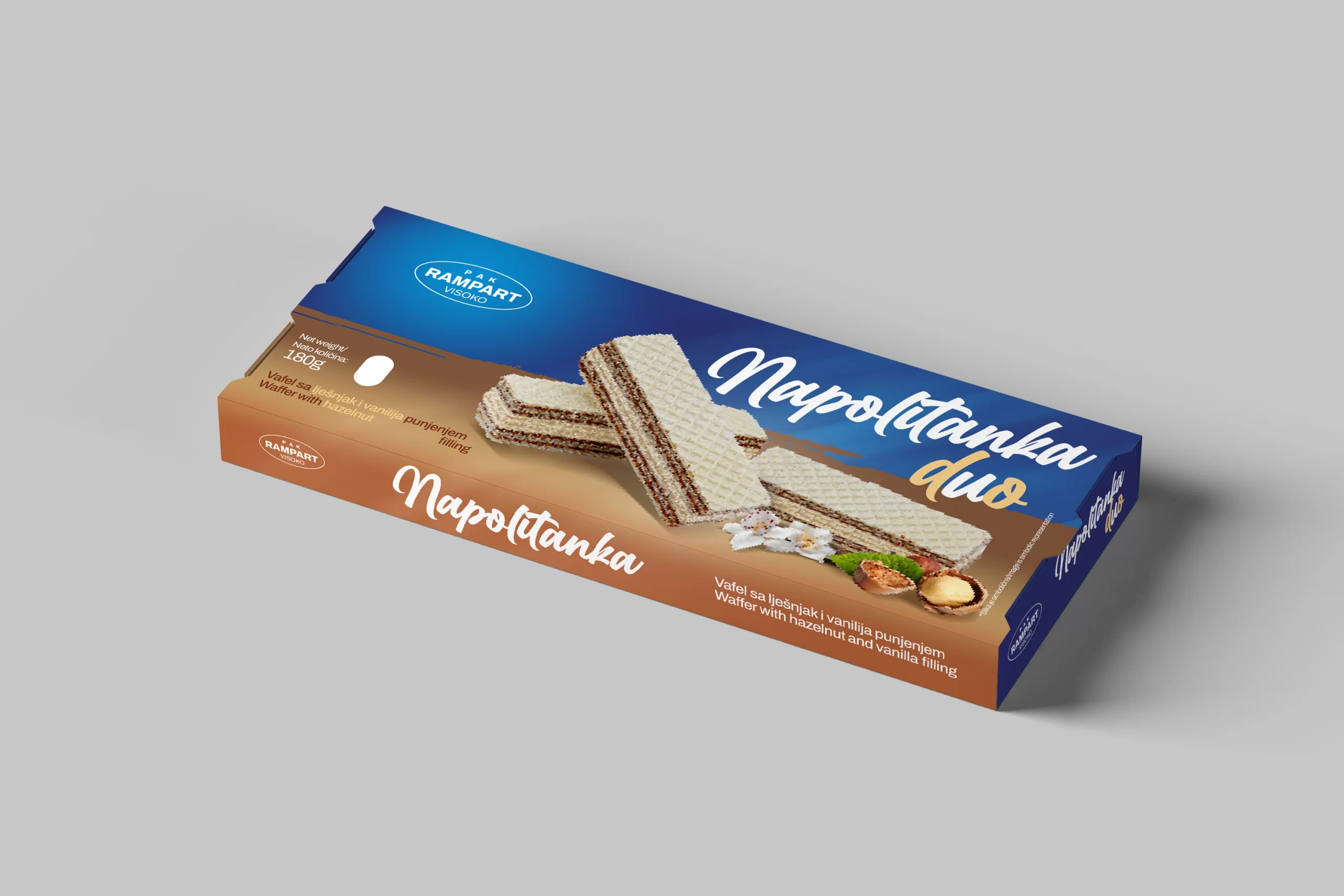
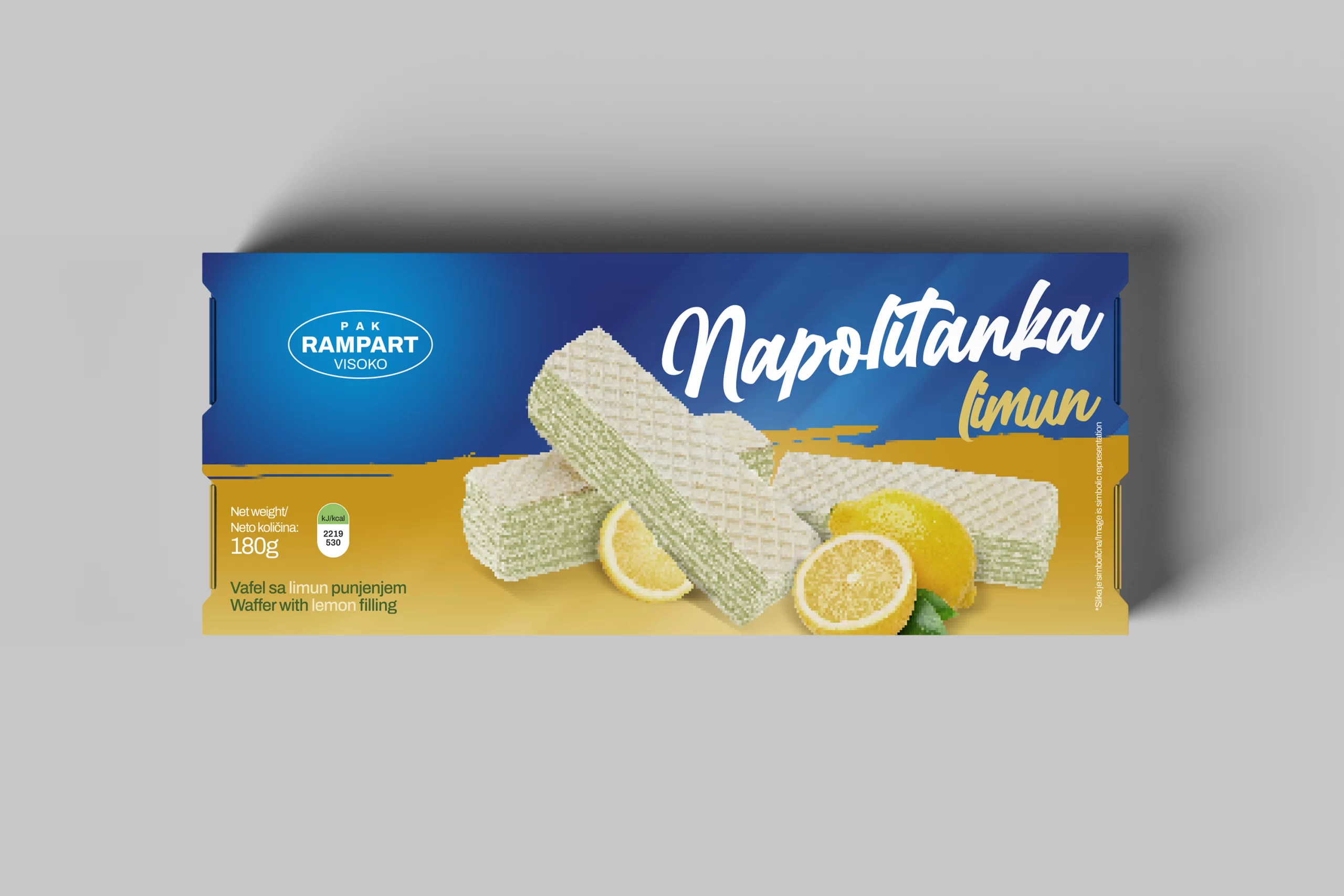
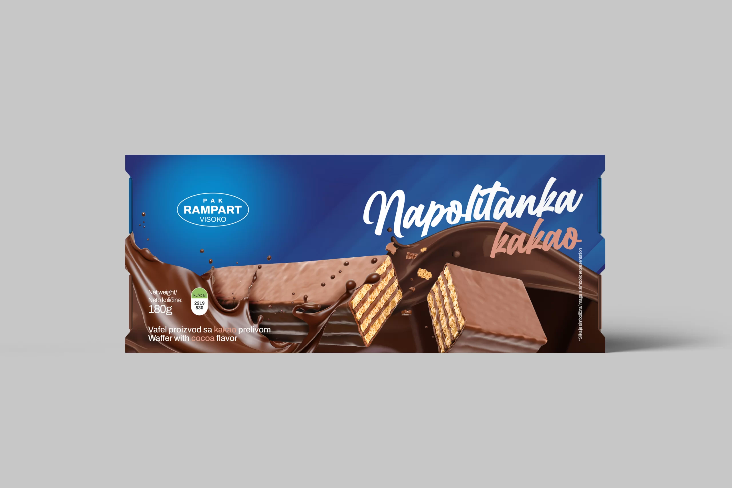
RAMPART Visoko, a renowned name in the Bosnian confectionery industry, came to us with a clear challenge—lack of brand consistency across their product line. Over time, their packaging had evolved independently, leading to a fragmented visual identity where each product looked like it came from a different company. This not only affected shelf recognition but also diluted the overall perception of the brand in a highly competitive market.

Task

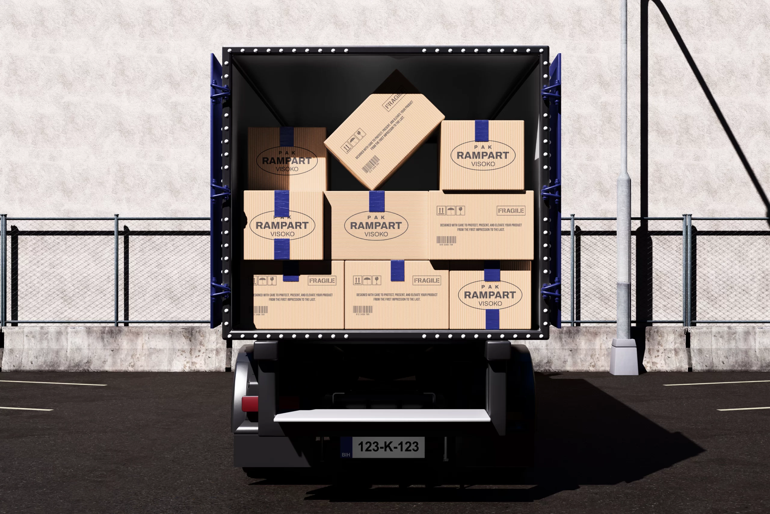
Our task was to create a unified, modern packaging system that would bring all of RAMPART’s products under one strong and cohesive brand identity. At the same time, the new design needed to resonate with younger consumers while maintaining the familiarity and trust built with their existing audience. The result is a refreshed brand presence that feels both current and rooted in tradition—ready to stand out and scale.

  • Strategy

    Brand Positioning

  • Design

    Branding, Art Direction, Packaging

  • Client

    RAMPART

A Modern Logo
Rooted in Heritage,
Built for the Future.

A key part of the transformation was updating the RAMPART logo to match the new art direction. The original logo carried heritage and recognition but lacked the clarity and versatility needed for modern applications. Our approach was to preserve the essence of the brand while refining its visual language—streamlining the shape, cleaning up the typography, and creating a more balanced structure.

The new logo is simple, bold, and adaptable, making it suitable for everything from packaging to digital use. Its modernized form gives the brand a more confident, approachable feel, while still honoring its roots. By placing the redesigned logo at the center of the new visual system, we created a strong anchor point that ties together all product lines and supports long-term brand growth.

Logo redesign

Strudel

The redesigned strudel packaging captures the warmth and comfort associated with this classic product. Using rich, earthy tones and appetizing visuals, we created a look that feels homemade yet elevated—connecting emotionally with consumers who value tradition and authenticity.

At the same time, we introduced modern design elements to ensure shelf appeal and brand recognition. Clean typography, consistent branding, and clear product hierarchy make the packaging both attractive and easy to navigate, especially for younger shoppers looking for a reliable snack with a familiar taste.

Packaging design for Rampart Visoko

Tea Biscuits

Čajni keks, or tea biscuits, are a staple in many households, and we wanted the packaging to reflect their everyday elegance. The new design uses soft, inviting tones and clean, minimalistic composition to emphasize the product’s simplicity and quality.

We focused on visual clarity and calmness—creating packaging that feels gentle and refined, just like the product itself. The updated design gives this everyday treat a modern touch, making it feel fresh and relevant while staying true to its comforting role in daily rituals.

Packaging design for Rampart Visoko

Domestic Cookie

The packaging for RAMPART’s domestic cookies (domaći keks) is a tribute to the brand’s long-standing reputation and the timeless quality of the product. We leaned into nostalgic cues—soft textures, familiar tones, and subtle design accents—that reflect the homemade essence these cookies are known for.

But we didn’t stop at nostalgia. We refined the layout to feel more structured and modern, allowing it to resonate with both loyal customers and new audiences. The result is a product that feels trustworthy, high-quality, and proudly local—wrapped in packaging that speaks to both past and present.

Rampy Biscuit

For Rampy Keks—a biscuits specially made for toddlers—we adapted the established art direction, but with a softer, more simplified approach. The goal was to maintain brand consistency while creating a lighter, more approachable design tailored to young children and their parents.

This subtle yet thoughtful shift preserves the identity of the RAMPART brand while making Rampy Keks stand out as a dedicated product for little ones. The result is packaging that feels warm and playful, speaks to care and quality, and earns the trust of parents—all while keeping the visual language aligned with the rest of the redesigned product line.

Packaging design for Rampart Visoko

Cinnamon Biscuit

For the Cinnamon Biscuit, we followed the established visual direction developed for RAMPART’s core product line, ensuring consistency in layout, typography, and overall structure. The goal was to seamlessly integrate this product into the refreshed lineup while allowing its unique flavor profile to stand out through design. We maintained a clean and balanced composition, letting the product speak through carefully styled imagery and a warm, inviting color palette.

To highlight the comforting and aromatic nature of cinnamon, we introduced soft, spiced tones—such as warm browns and beige accents—that evoke a sense of coziness and homemade goodness. The design feels both modern and nostalgic, appealing to a wide audience while reinforcing RAMPART’s values of quality, tradition, and visual harmony across all products.

Packaging design for Rampart Visoko

Waffer

When redesigning the waffer packaging, our goal was to bring it in line with the new visual system established across RAMPART’s core products—Strudel, Domestic Cookie, and Tea Cookie. We applied the same principles of consistency, clarity, and brand recognition, ensuring Waffer feels like an integral part of the family. The layout follows the same structured hierarchy, with strong product imagery, clean typography, and a clear emphasis on flavor.

However, Waffer stands out with a more playful and vibrant energy to match its lighter, crispier character. We used brighter tones and subtle graphic accents to give it a livelier feel while staying true to the overall visual language. The result is a package that’s unified with the rest of the lineup, yet distinct in personality—perfectly positioned to capture the attention of younger consumers.

Packaging design for Rampart

Let's create something
meaningful together.

Back

This website stores cookies on your computer. Cookie Policy